Pixlr E: A Photo Editor in the Cloud
Pixlr E is a photo editing web app.
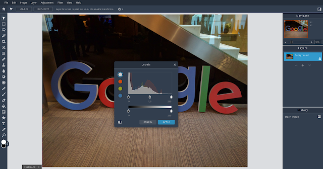
Along with the basic image editing features, it provides advanced tools for retouching, applying effects, drawing, filtering, and adjusting photos. Pixlr E also supports layers and a versatile command history, which lets you undo back to a specific state or change.
The workspace is configurable and you can minimize or remove the right sidebar to get a larger editing area. There are keyboard shortcuts, too.
The app feels intuitive and easy to master. Although I use Pixlr E mostly on Chrome OS, it works well and is fast on all platforms and devices.
Pixlr E is surprisingly fast and usable also on Android, even on my low-end Lenovo Tab E7 tablet. However, on the tablet, tapping the confirmation button in dialogs doesn’t seem to do anything. There’s another quirk on Android. The editing dialogs can’t apparently be moved, so they cover most of the image and you can’t see the effects of the changes as you operate the controls.
The suite comprised the basic Pixlr Express, with a focus on simplicity, and the more advanced Pixlr Editor.
When the stock media company 123RF acquired Pixlr a few years ago, the future of the Pilxr suite wasn’t clear. Not only because the plans of 123RF weren’t known.
The Pixlr editors were Flash apps, so their days were numbered.
But 123RF invested into the products and rewrote the apps from scratch using contemporary web technologies. It first released Pixlr X, the successor of Pixlr Express, and now Pixlr E is the successor of the Pixlr Editor.
These new apps have a common design that’s modern and clean.
The new Pixlr suite offers a generous free plan with nearly all the features and no intrusive ads, as well as a paid option with additional stock media and features.
Along with the basic image editing features, it provides advanced tools for retouching, applying effects, drawing, filtering, and adjusting photos. Pixlr E also supports layers and a versatile command history, which lets you undo back to a specific state or change.
 |
| Pixlr E with the light theme on my ASUS Chromebox. |
The workspace is configurable and you can minimize or remove the right sidebar to get a larger editing area. There are keyboard shortcuts, too.
The app feels intuitive and easy to master. Although I use Pixlr E mostly on Chrome OS, it works well and is fast on all platforms and devices.
Pixlr E is surprisingly fast and usable also on Android, even on my low-end Lenovo Tab E7 tablet. However, on the tablet, tapping the confirmation button in dialogs doesn’t seem to do anything. There’s another quirk on Android. The editing dialogs can’t apparently be moved, so they cover most of the image and you can’t see the effects of the changes as you operate the controls.
The Pixlr app suite
In the early days of Chrome OS, Autodesk’s Pixlr suite of image editing web apps was the default recommendation for processing photos in the cloud. And pretty much the only practical choice.The suite comprised the basic Pixlr Express, with a focus on simplicity, and the more advanced Pixlr Editor.
When the stock media company 123RF acquired Pixlr a few years ago, the future of the Pilxr suite wasn’t clear. Not only because the plans of 123RF weren’t known.
The Pixlr editors were Flash apps, so their days were numbered.
But 123RF invested into the products and rewrote the apps from scratch using contemporary web technologies. It first released Pixlr X, the successor of Pixlr Express, and now Pixlr E is the successor of the Pixlr Editor.
These new apps have a common design that’s modern and clean.
The new Pixlr suite offers a generous free plan with nearly all the features and no intrusive ads, as well as a paid option with additional stock media and features.


